FitFind Fitness App
UX Microcopy & Content Design
Role
UX Content Design & UX Writer
Industry
Content Design, UX Writing, Microcopy, User Research, Mobile App, Figma
Duration

Challenge
Fitness tracking apps suffer from high abandonment rates—research shows 60-70% of users quit within the first month.
Primary pain points include overwhelming onboarding processes, unclear goal-setting interfaces, and motivational content that feels generic or discouraging. Users download with enthusiasm but abandon when the interface feels confusing or the tone feels cold and clinical
Fitness apps face a common problem: users download with enthusiasm but abandon within weeks when the interface feels confusing, or the tone feels cold and clinical. My goal was to transform every touchpoint into a moment of encouragement, turning "Continue" buttons into "Let's Go!" moments, error messages into helpful guides, and empty states into invitations rather than dead ends.
Approach
Conducted user research to identify specific motivation barriers and friction points through interviews and competitive analysis
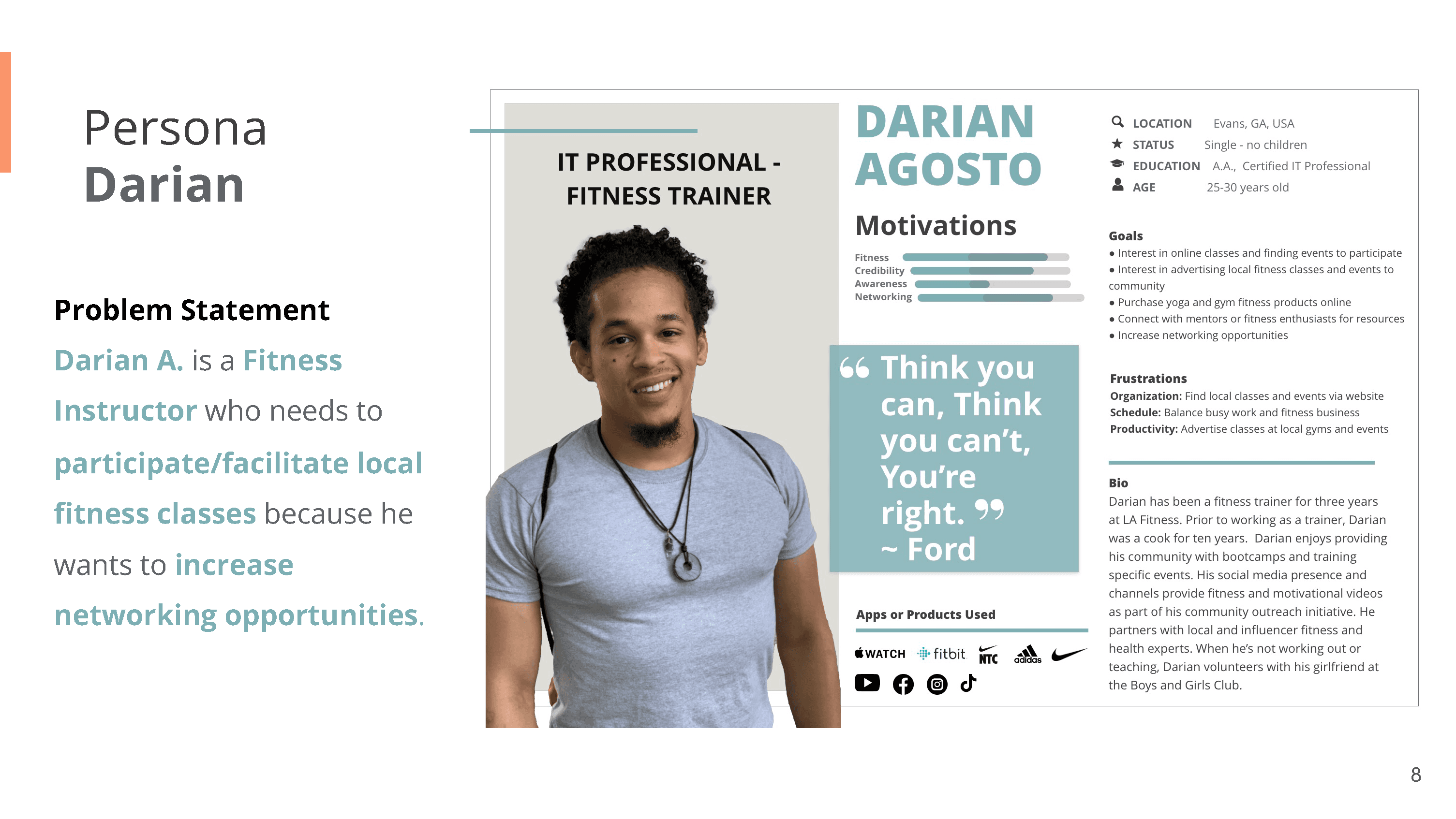
Created user personas representing different fitness levels and goals (beginners, returning athletes, maintenance users)
Designed information architecture prioritizing clarity over feature density
Developed comprehensive microcopy system that encourages without overwhelming
Created voice & tone guidelines balancing motivation with authenticity—equal parts personal trainer and supportive friend
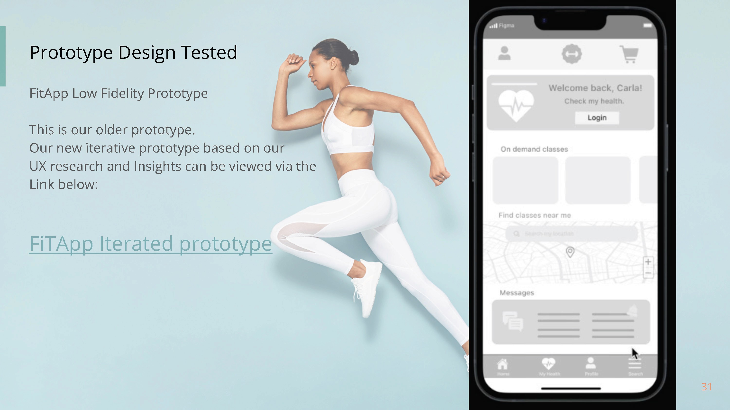
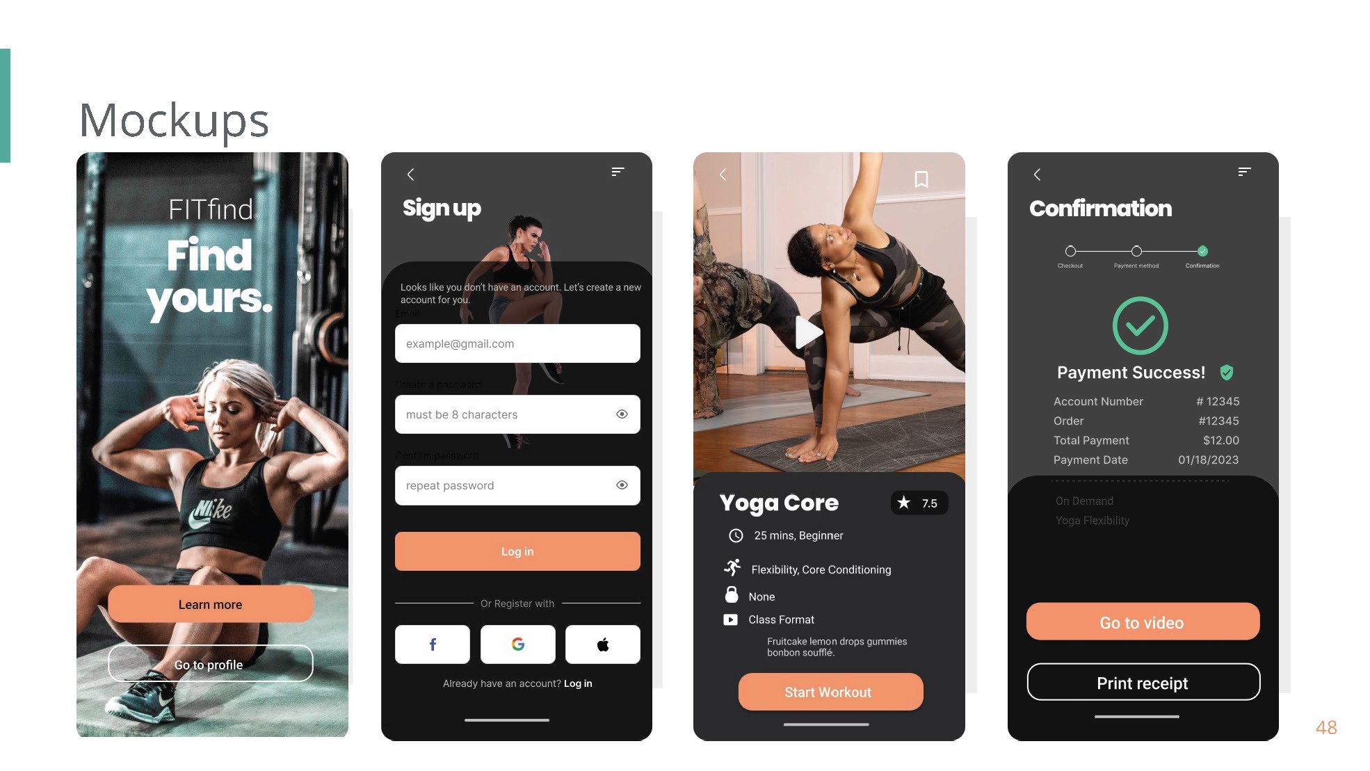
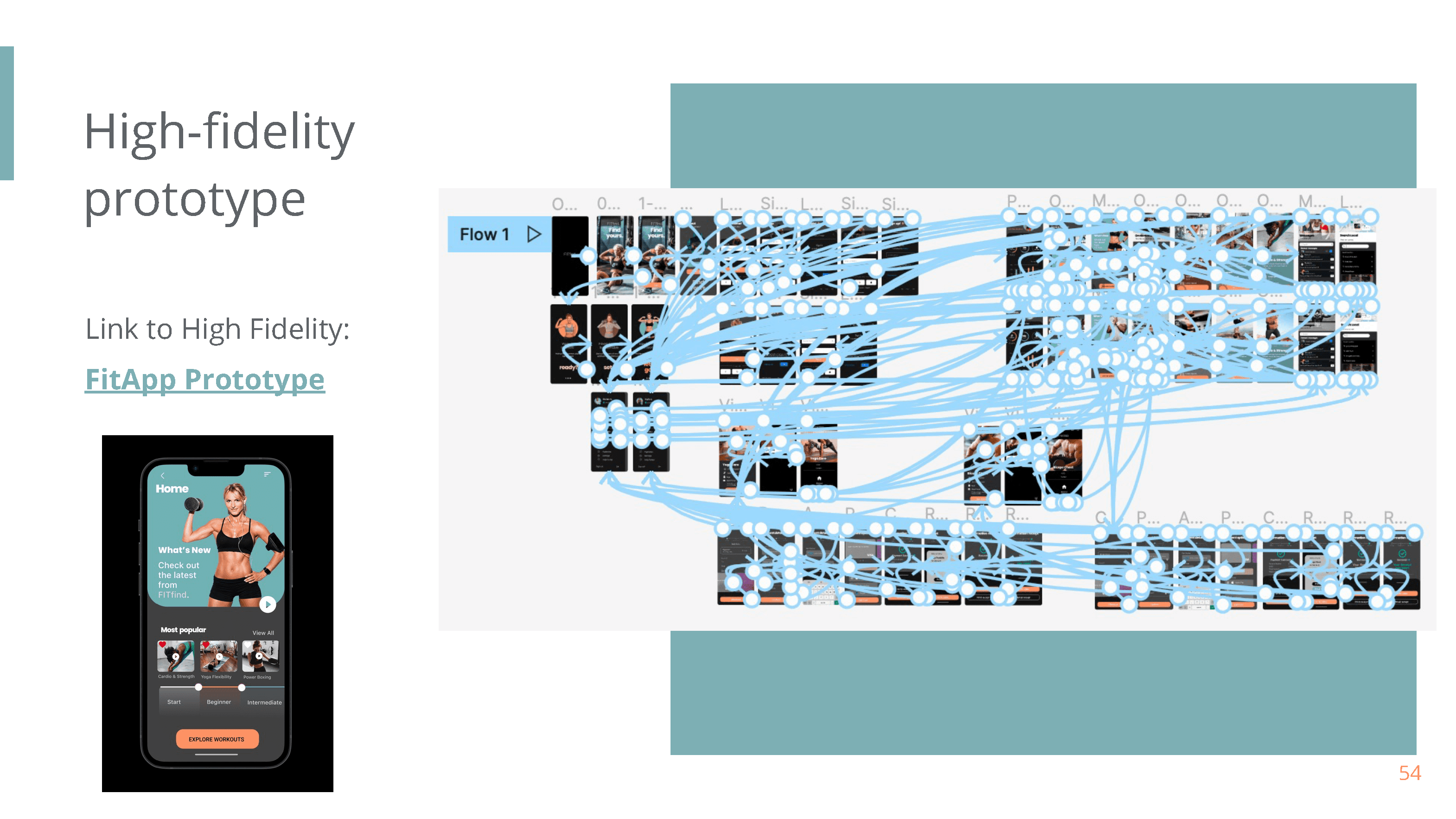
Prototyped complete user flows in Figma with actual interface content (not lorem ipsum)
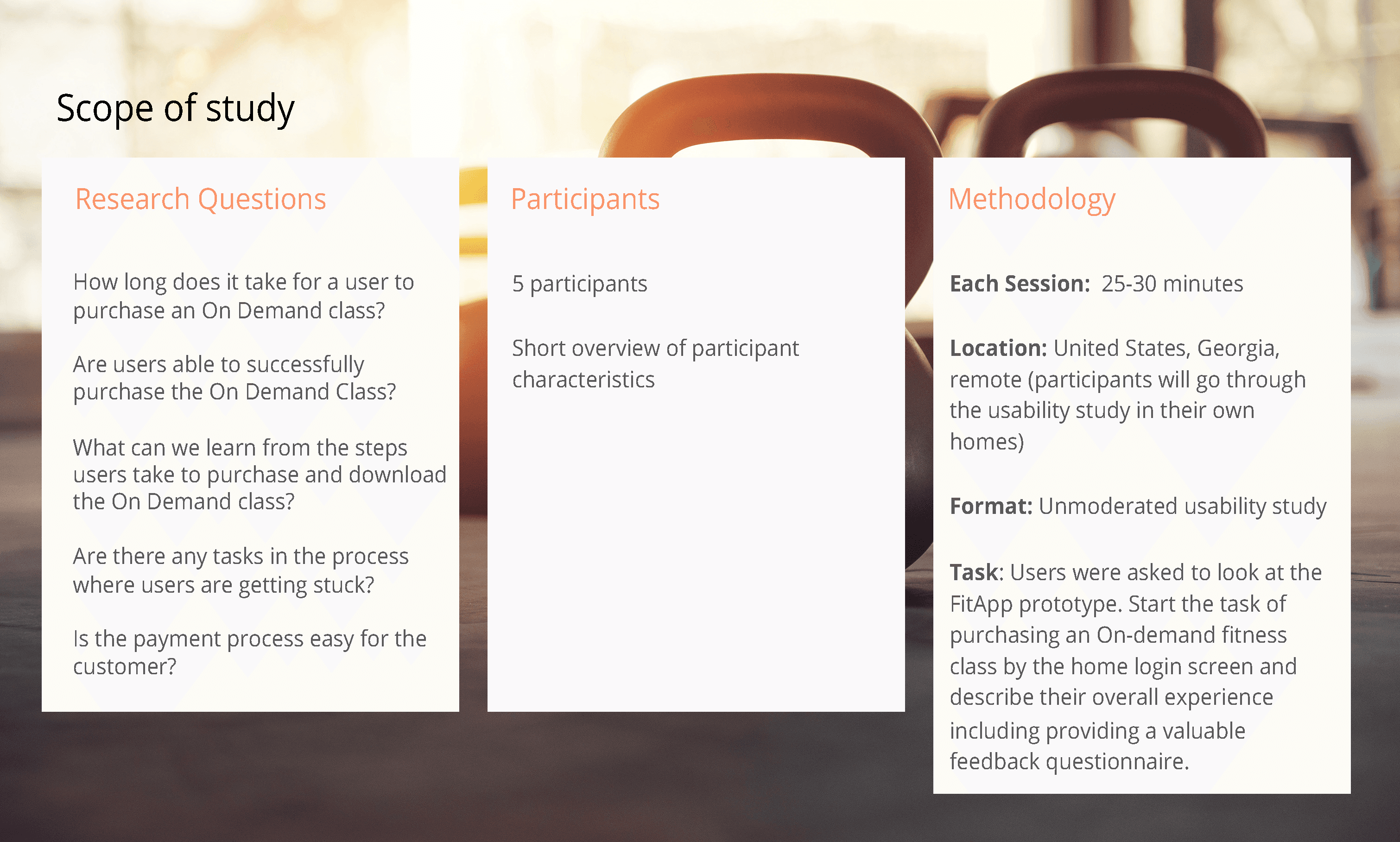
Conducted usability testing with target users and iterated based on feedback
Content Design Solutions
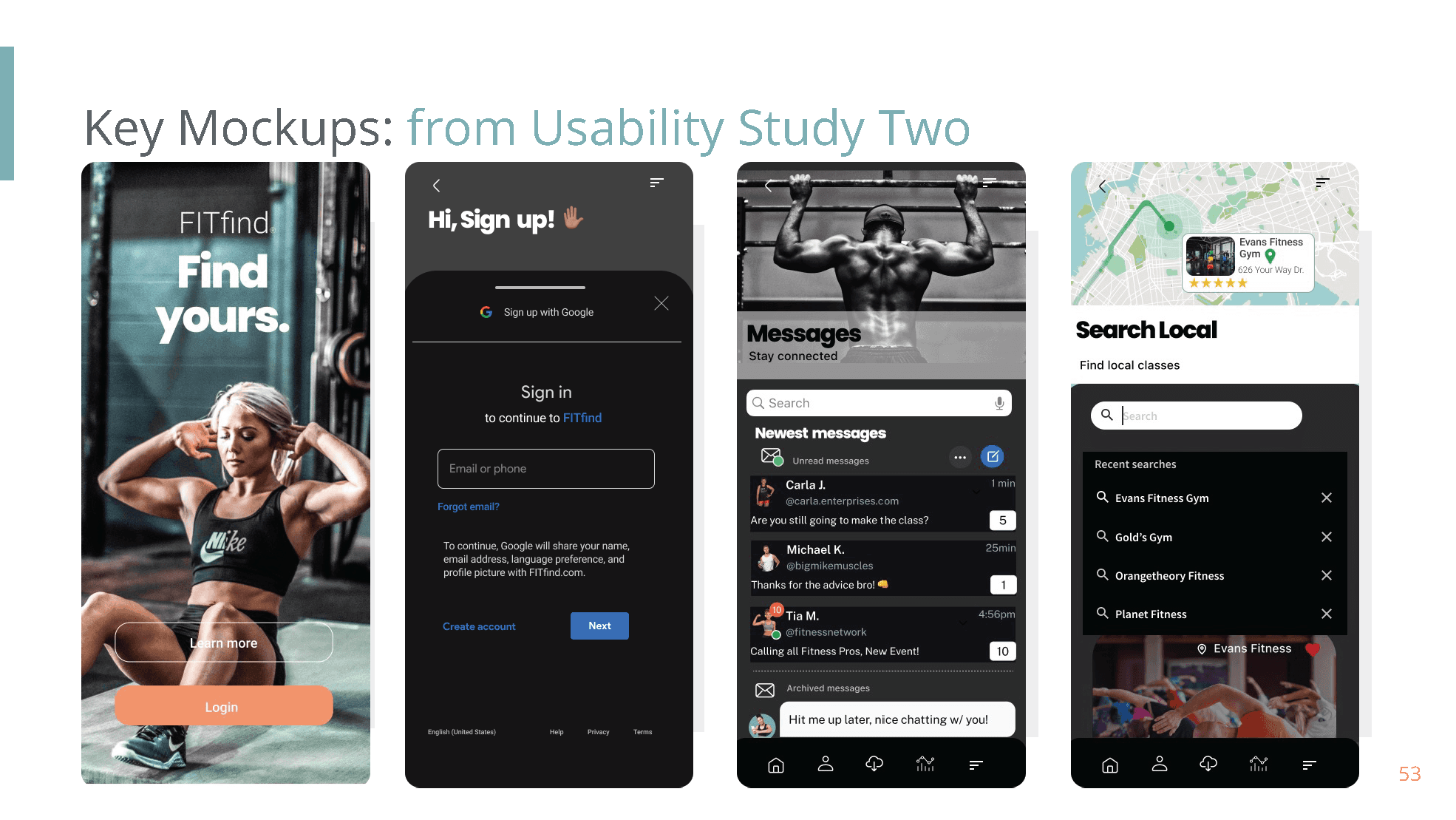
Onboarding: Simplified 8-screen onboarding to 3 essential steps with conversational microcopy that builds confidence rather than intimidation
Goal Setting: Clear, jargon-free goal options with helpful context ("What's this?" tooltips) instead of assuming user knowledge
Progress Tracking: Encouraging microcopy that celebrates small wins and reframes "failures" as learning opportunities
Empty States: Motivational messaging that guides next actions rather than leaving users uncertain
Permissions: Transformed technical asks into conversational invitations ("Get your daily motivation reminder? We'll cheer you on but never spam you")
Result
Streamlined onboarding experience with clear, motivational content architecture. User testing showed improved comprehension of features and reduced cognitive load during initial app exploration. Created a scalable microcopy system that maintained a consistent, encouraging voice across all product touchpoints.
Skills Demonstrated
User Research • User Personas • Information Architecture • Figma Prototyping • Microcopy Development • Voice & Tone Guidelines • Usability Testing • Iterative Design • Content Strategy • Mobile UX Writing
Project Context
Role: UX Writer, Content Strategist
Project Type: Academic UX Design Case Study (Google UX Design Certificate Program)
Tools: Figma, User Research, Content Strategy Frameworks
Deliverables: Complete app microcopy system, voice & tone guidelines, user flow content
Why This Matters
This project demonstrates my ability to think beyond individual words and understand how content shapes user behavior and emotional experience. Good UX writing isn't just about clarity; it's about using language to build confidence, reduce anxiety, and create moments of delight that keep users engaged. Every button label, error message, and notification is an opportunity to reinforce the brand promise and help users succeed.
Tags
Content Design, UX Writing, Microcopy, User Research, Mobile App, Figma
👉🏽Download the full Case Study
Challenge
Fitness tracking apps suffer from high abandonment rates—research shows 60-70% of users quit within the first month.
Primary pain points include overwhelming onboarding processes, unclear goal-setting interfaces, and motivational content that feels generic or discouraging. Users download with enthusiasm but abandon when the interface feels confusing or the tone feels cold and clinical
Fitness apps face a common problem: users download with enthusiasm but abandon within weeks when the interface feels confusing, or the tone feels cold and clinical. My goal was to transform every touchpoint into a moment of encouragement, turning "Continue" buttons into "Let's Go!" moments, error messages into helpful guides, and empty states into invitations rather than dead ends.
Approach
Conducted user research to identify specific motivation barriers and friction points through interviews and competitive analysis
Created user personas representing different fitness levels and goals (beginners, returning athletes, maintenance users)
Designed information architecture prioritizing clarity over feature density
Developed comprehensive microcopy system that encourages without overwhelming
Created voice & tone guidelines balancing motivation with authenticity—equal parts personal trainer and supportive friend
Prototyped complete user flows in Figma with actual interface content (not lorem ipsum)
Conducted usability testing with target users and iterated based on feedback
Content Design Solutions
Onboarding: Simplified 8-screen onboarding to 3 essential steps with conversational microcopy that builds confidence rather than intimidation
Goal Setting: Clear, jargon-free goal options with helpful context ("What's this?" tooltips) instead of assuming user knowledge
Progress Tracking: Encouraging microcopy that celebrates small wins and reframes "failures" as learning opportunities
Empty States: Motivational messaging that guides next actions rather than leaving users uncertain
Permissions: Transformed technical asks into conversational invitations ("Get your daily motivation reminder? We'll cheer you on but never spam you")
Result
Streamlined onboarding experience with clear, motivational content architecture. User testing showed improved comprehension of features and reduced cognitive load during initial app exploration. Created a scalable microcopy system that maintained a consistent, encouraging voice across all product touchpoints.
Skills Demonstrated
User Research • User Personas • Information Architecture • Figma Prototyping • Microcopy Development • Voice & Tone Guidelines • Usability Testing • Iterative Design • Content Strategy • Mobile UX Writing
Project Context
Role: UX Writer, Content Strategist
Project Type: Academic UX Design Case Study (Google UX Design Certificate Program)
Tools: Figma, User Research, Content Strategy Frameworks
Deliverables: Complete app microcopy system, voice & tone guidelines, user flow content
Why This Matters
This project demonstrates my ability to think beyond individual words and understand how content shapes user behavior and emotional experience. Good UX writing isn't just about clarity; it's about using language to build confidence, reduce anxiety, and create moments of delight that keep users engaged. Every button label, error message, and notification is an opportunity to reinforce the brand promise and help users succeed.
Tags
Content Design, UX Writing, Microcopy, User Research, Mobile App, Figma
👉🏽Download the full Case Study
Other projects

KelleeSetGo
Strategic Content Framework & Brand Voice Development

Natural Self Goddess Brand Launch
UX Microcopy & Content Strategy for Wellness Platform

GardenFever
UX Case Study - Gardening & Plant Care Application

MeeHub Inc.
Brand Guidelines & Content Design Systems
Alfalfa: The Forgotten Superfood | NSG Herb Hub Library
Copywriting, Scriptwriting & Content Design

Weixin-WeChat Winning Campaign Appeal through Audience Emotional Likes
Blog Posts

From Hashtags to Hope
Content Writing - Blog Posts

Analyzing the Digital Footprint of Tiffany & Co.’s Digital Marketing Strategy
Brand Narratives & Storytelling

EyeAmLove Journals and Website Digital Products Soft Launch
Long-form Content Writing & UX Copywriting

© 2026 Daria Smith Giraud Inc. All Rights Reserved. Operated by DariaCreativeCo®.
© 2026 Daria Smith Giraud Inc. All Rights Reserved. Operated by DariaCreativeCo®.
© 2026 Daria Smith Giraud Inc. All Rights Reserved. Operated by DariaCreativeCo®.